Pages

Wednesday, October 8, 2008

Typography in the Media

This is a poster for Barack Obama, the presidential nominee for the Democratic party. This piece of political propaganda is an excellent example of the effectiveness of typography. The word "hope" is in bold letters, that gives the impression that Obama is a strong and reliable leader. This is very effective and maintains the theme throughout the rest of Obama's posters.
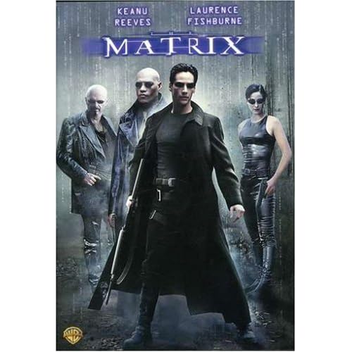


This is the movie poster for the popular movie franchise known as The Matrix. The typography for this poster is very effective and original, as it was one of the first movies to bring the idea of "the digital era" to the big screen. The movie was widely popular and this type of font, a digital and futuristic font, can be found commonly today.


The new Guns N' Roses "Chinese Democracy" has been in production for over 10 years and this past weekend was FINALLY released. Whether or not the music is good is a different story, but one thing's for sure, a little extra effort could have been put into the album typography. With an album titled "Chinese Democracy", one would think that the typography would be something like this...

But no, the band went with the most generic font they could find, leaving the album cover without a lasting appeal. This album cover looks very rushed, which is ironic considering the album took 10 years to make.

Monday, October 6, 2008

CD Cover Assigment


What I wanted to accomplish with this Against Me! CD cover was to create a cover to a live album that would stand out if I were to come across it in a record store. Many album covers these days are very complex with lots of Fireworks and Photoshop work done on them. Sometimes, the simplest album cover can leave the biggest impact. The cover for Against Me!’s latest album, New Wave (image provided on this disc), was very simple, however it had a huge impact on the music scene. The cover features an outline of a panther growling on top of a black background, leaving an impression of epic proportions. This image sums up the album in one image. After all, what could be stronger than a panther growling in your face? I drew inspiration from this album cover, as I decided to make their live album go with the theme of
“a little can be a lot”.
The main image is a picture I took of lead singer Tom Gabel in his signature “rock star” pose. Originally, the background was filled with colour, like Mr. Gabel is in the picture. However, I realized it would be more effective if the background was black and white, as it would make Tom appear larger and more important. I then blurred Tom’s head and strumming arm to emphasize the singer playing his music as hard as he can.
Next to Tom’s head is the band’s name in bold “punk” letters with a yellow glow. The purpose of the yellow was to keep the New Wave theme apparent in their live album, as black and yellow are the main colours featured in the album art. Since Against Me! is a punk band, the idea of this type of font in big letters reflects the intensity of their music. At the bottom, in a basic yet futuristic font, the words “Live In Toronto” lay faintly across the bottom. The reason for this is that the listener should realize this is a live album before ever listening to it due to the live image of Mr. Gabel.
Essentially, I wanted to design a simple and effective cover that I would be proud to see if it were laying in my record collection. I am very happy with the way the CD cover turned out and am proud of the way I turned an ordinary image into something more interesting. This cover would appeal to Against Me!’s demographic, which is usually males and females between the ages of 16 and 24. It captures the intensity of an Against Me! show, as the band’s name on the cover is rather “in your face”. Anyone who’s experiences Against Me! in a live setting will not hesitate to describe the experience. I feel I have captured the essense of an Against Me! show in this one image, just like their New Wave album cover inspired me to do.

Sunday, September 28, 2008

GIF's

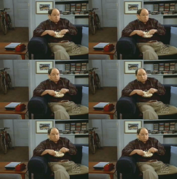
I am a member of a message board. The name of this board isn't important, as that's not what I'm about to discuss. What I enjoy about message boards isn't the conversations you can have with people, but rather the 2X2 avatar images people have under their names. For example, here is a personal favourite.


and another:

I never quite understood how people made them. In fact, I still don't know how people do them. However, thanks to the digital media lecture last week, I now know the difference between JPEG's and GIF's and understand that GIF's are the only format that can show animation.

Monday, September 15, 2008

CRAP Pictures


1)This is a poster for the band Stars from their Toronto show on June 7, 2008. This poster is an excellent example of contrast, alignment and proximity. The big orange letters spelling Stars is an excellent example of contrast, because the letters stand out from the blue and green background. It is the first thing that grabs your attention when you look at the poster.

The poster is also an example of alignment and proximity. For one, the letters are aligned perfectly next to eachother and follow the same direction. As well, the buildings, as well as the letters, are also close together and not scattered throughout the page. Since it's a city landscape, the artists knew to keep the buildings close together, as they would appear in real life.


2) Upon entering the subway for my daily journey home from class, I noticed a teenager wearing an Alexisonfire shirt. Usually, I wouldn't look at someone's shirt so critically, but this one I took a moment to take in, especially since we had just talked about the CRAP principles in class. The shirt is an excellent example of the CRAP principles. The white really contrasts with black and red, the darker colours on the shirt. As well, they words "Alexisonfire" and "Crisis" are perfectly aligned and repeated several times. The words are close together so your eyes don't wander too far. This shirt is an excellent advertising tool for the band as any person walking by will get the band name subconciously stuck in their head.

3) This is a newspaper ad found in the National Post for the Lotto 649 lottery. The orange lottery ticket is an example of contrast, as it jumps off the page and catches your attention right away, mainly because of the plain white background. The ad also has a nice alignment to it, as all the text and images are centered, except for the man in the left corner who is doing his "happy dance". I feel they could have done a better job placing this man, as he seems a bit out of place.

4) This ad was also found in The National Post and is for Porter Airlines, a new airline that takes off from Olympic Island in Toronto. This ad has a good use of repetition with the maple leaves featuring different prices. The use of the maple leaf delivers the message that this is a Canadian company that people can trust. The leaves are aligned quite nicely, as they fall down the page and lead your eyes to information and their mascot (the raccoon).

Wednesday, September 3, 2008

Digital Media. Media that is Digital.

Prior to my first lecture, I was well aware of the term "Digital Media". In high school, I began taking digital media classes in Grade 10. Though I may not have been the best in my school, I was satisfied with the amount of knowledge I had for programs like Adobe Photoshop, In Design, and Final Cut. My experience on the school newspaper and my hobby of making creative videos and documentaries helped inprove my skills in the Digital Media field.

In the days following my first lecture, not much has changed. However, I was very interested when we began talking about how normal television has become more interactive and has moved onto the internet. The idea of fans getting more involved with their favourite television show really appealed to me. This may be because I have thought about this topic before, but have never shared my thoughts with anyone. In class, we talked about a kids cartoon that moved its show onto the internet in order for fans to get more involved and create a new character. This reminded me of Lost, one of my favourite shows. I watch Lost every week and have sene every episode. However, people are always asking me if I have kept up to date with the online content of the show and truthfully, I don't have time for this. I have other things to do then to spend hours online watching scenes that may be important somewhere down the line. Regardless, the fact that this thought passed my mind in the first class, which was mainly introductions, shows how interested I am in Digital Media.

The knowledge of Digital Media is essential for a new RTA student. Since the world is moving at such a fast pace, and TV and radio have moved online, students must know the skills that are incorporated with this in order to survive in the industry. I feel it is very important to know and students will only benefit from the knowledge, even if they don't do well in the class.