I have always been a huge music video fan. As a kid, I was introduced to Much Music and MTV at a very early age, mainy because of my illegal satellite dish that gave me access to MTV, MTV 2, and VH1 (don't report me!). I even remember watching MTV's special where they counted down the videos they've shown from 1 million to the first one ever. As we all know, it was "Video Killed The Radio Star". I've watched shows on the most expensive videos, and the worst videos. I am a music video addict.
Today, Much Loud is always the first station I flip to when I turn on my TV. I can just sit there and watch bands I don't even like make fools of themselves. I see bands who try to look bigger than they are, and bands who may have tried a little too hard. Yet, it doesn't matter how much moneya band put into a video, because I find some of the most effective videos are the live performance type. When videos started, this is what it was all about. However, with the invention of MTV and Michael Jackson's "Thriller", the music video became more of a production. Now, the more expensive your video was, the more attention it got. Sure, there have been some cool videos that have higher budgets, but it's pretty clear that it wasn't about the music anymore. It was all about how you can brand yourself.
Rap videos take this too literally. When I say it's all about the money, I mean the production. When rappers hear this, they hear how much useless stuff they can show in their videos that cost them lots of money. Girls, cars, and bling. It's less about the music quicker and quicker.
However, now videos are beginning to go back to the music. Live performance videos are popular once again and now anyone can make a video and post it on youtube. I find the trick for bands these days is to not takw themselves too seriously as no one will really care. What shows more credibility and talent?
This...
Attack in Black "Hunger of the Young"
or this...
Britney?!!
If you don't have the talent to do it live, then it doesn't matter how much money you have in the video. Nowadays, it's up to the viewer to be the judge. Hopefully they make the right choice
Sunday, October 26, 2008
Wednesday, October 8, 2008
Typography in the Media
 This is a poster for Barack Obama, the presidential nominee for the Democratic party. This piece of political propaganda is an excellent example of the effectiveness of typography. The word "hope" is in bold letters, that gives the impression that Obama is a strong and reliable leader. This is very effective and maintains the theme throughout the rest of Obama's posters.
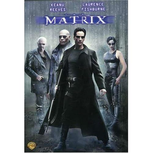
This is the movie poster for the popular movie franchise known as The Matrix. The typography for this poster is very effective and original, as it was one of the first movies to bring the idea of "the digital era" to the big screen. The movie was widely popular and this type of font, a digital and futuristic font, can be found commonly today.

The new Guns N' Roses "Chinese Democracy" has been in production for over 10 years and this past weekend was FINALLY released. Whether or not the music is good is a different story, but one thing's for sure, a little extra effort could have been put into the album typography. With an album titled "Chinese Democracy", one would think that the typography would be something like this...

But no, the band went with the most generic font they could find, leaving the album cover without a lasting appeal. This album cover looks very rushed, which is ironic considering the album took 10 years to make.
Monday, October 6, 2008
CD Cover Assigment

What I wanted to accomplish with this Against Me! CD cover was to create a cover to a live album that would stand out if I were to come across it in a record store. Many album covers these days are very complex with lots of Fireworks and Photoshop work done on them. Sometimes, the simplest album cover can leave the biggest impact. The cover for Against Me!’s latest album, New Wave (image provided on this disc), was very simple, however it had a huge impact on the music scene. The cover features an outline of a panther growling on top of a black background, leaving an impression of epic proportions. This image sums up the album in one image. After all, what could be stronger than a panther growling in your face? I drew inspiration from this album cover, as I decided to make their live album go with the theme of
“a little can be a lot”.
The main image is a picture I took of lead singer Tom Gabel in his signature “rock star” pose. Originally, the background was filled with colour, like Mr. Gabel is in the picture. However, I realized it would be more effective if the background was black and white, as it would make Tom appear larger and more important. I then blurred Tom’s head and strumming arm to emphasize the singer playing his music as hard as he can.
Next to Tom’s head is the band’s name in bold “punk” letters with a yellow glow. The purpose of the yellow was to keep the New Wave theme apparent in their live album, as black and yellow are the main colours featured in the album art. Since Against Me! is a punk band, the idea of this type of font in big letters reflects the intensity of their music. At the bottom, in a basic yet futuristic font, the words “Live In Toronto” lay faintly across the bottom. The reason for this is that the listener should realize this is a live album before ever listening to it due to the live image of Mr. Gabel.
Essentially, I wanted to design a simple and effective cover that I would be proud to see if it were laying in my record collection. I am very happy with the way the CD cover turned out and am proud of the way I turned an ordinary image into something more interesting. This cover would appeal to Against Me!’s demographic, which is usually males and females between the ages of 16 and 24. It captures the intensity of an Against Me! show, as the band’s name on the cover is rather “in your face”. Anyone who’s experiences Against Me! in a live setting will not hesitate to describe the experience. I feel I have captured the essense of an Against Me! show in this one image, just like their New Wave album cover inspired me to do.
Subscribe to:
Comments (Atom)
